

Pantone Colour of the Year 2026: Cloud Dancer — A Shade for a Needed Reset
- Lucy Seremak

- Dec 8, 2025
- 5 min read
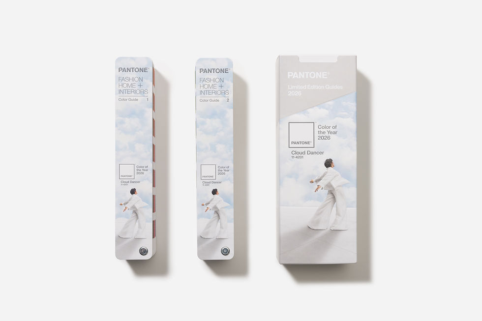
Pantone has crowned Cloud Dancer (PANTONE 11-4201) as the Colour of the Year for 2026, and for the first time in a long time, the announcement feels less like a trend forecast and more like a cultural diagnosis. This soft off-white arrives with none of the usual theatrics of a bold colour comeback. No “dopamine brights,” no neon resurgence, no digitally-born hyper tones. Instead, Pantone has chosen a hue that feels like silence after noise, breath after overwhelm, and clarity after confusion.
Leatrice Eiseman summarised it perfectly when she called Cloud Dancer “a discrete white hue offering a promise of clarity.” Laurie Pressman continued the thought, describing it as “an airy white that opens up space for creativity… so new insights and bold ideas can emerge.” In other words, it’s not just a colour — it’s a reset button dressed in linen.
And I couldn’t be happier about it.
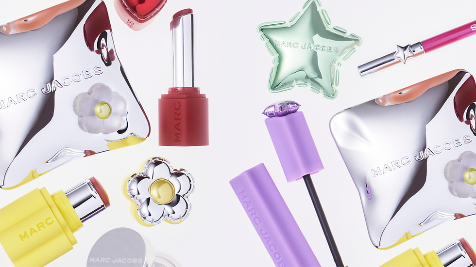
Why This Colour Matters for Beauty and Fashion
The Pantone Colour of the Year might look like a marketing stunt to the untrained eye, but inside fashion and beauty, it’s more like a tuning fork. Designers, marketers, product developers, and editors all feel the vibration. It sets the emotional temperature for the year ahead.
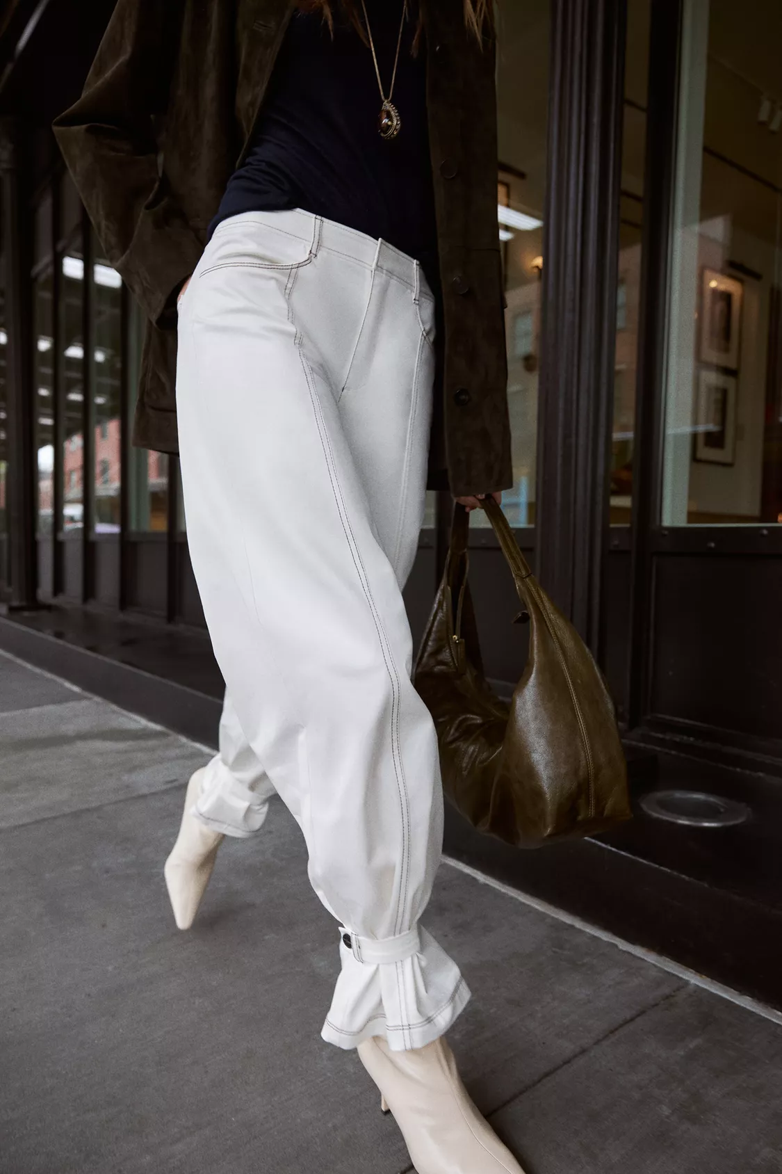
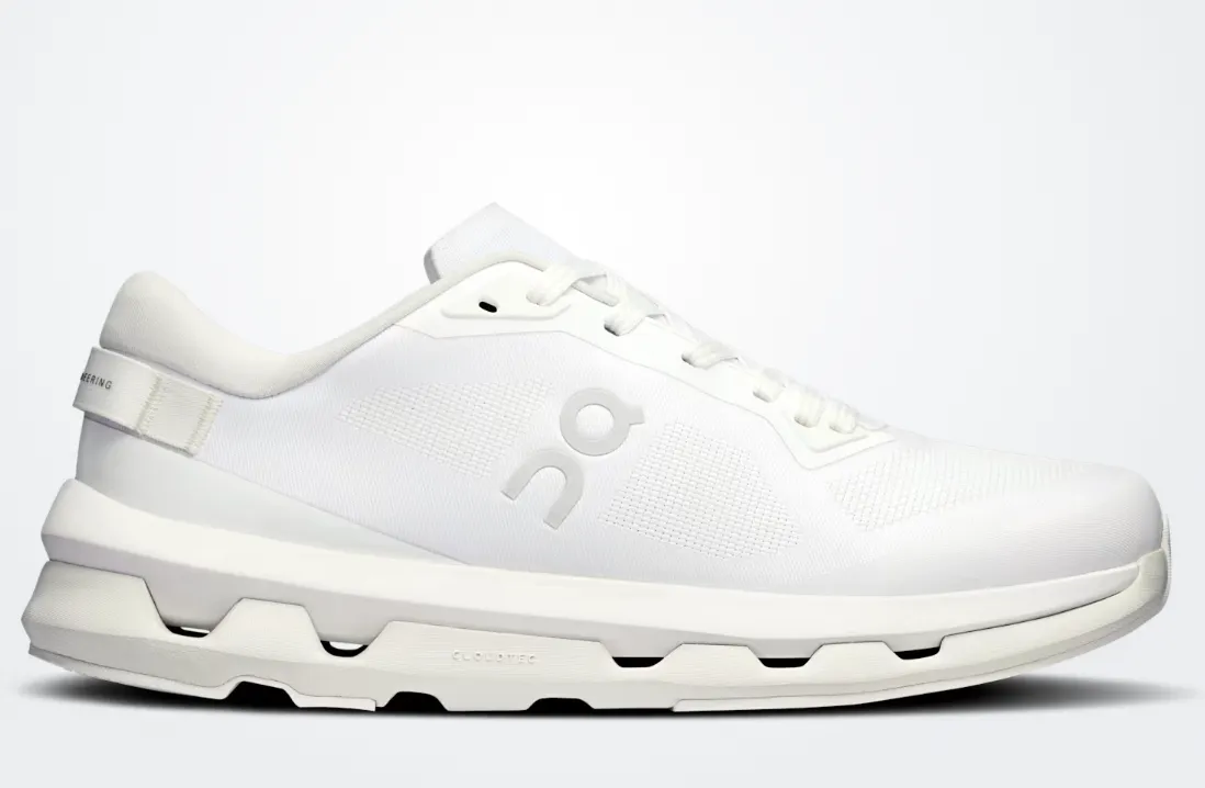
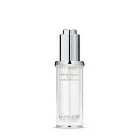
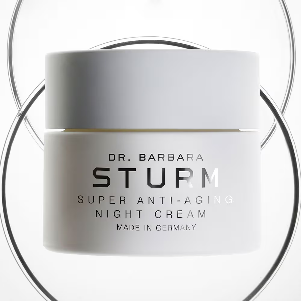
And Cloud Dancer is an interesting one, because it isn’t a flavour-of-the-month shade that appears in handbags and nail polish and quietly disappears. Off-white already lives everywhere: in tailoring, in packaging, in wellness aesthetics, in skincare routines, in retail design, in the “quiet luxury” movement that are there to stay.
What Pantone has done is elevate what was already culturally present. The colour isn’t new — it’s the permission to embrace it loudly is.
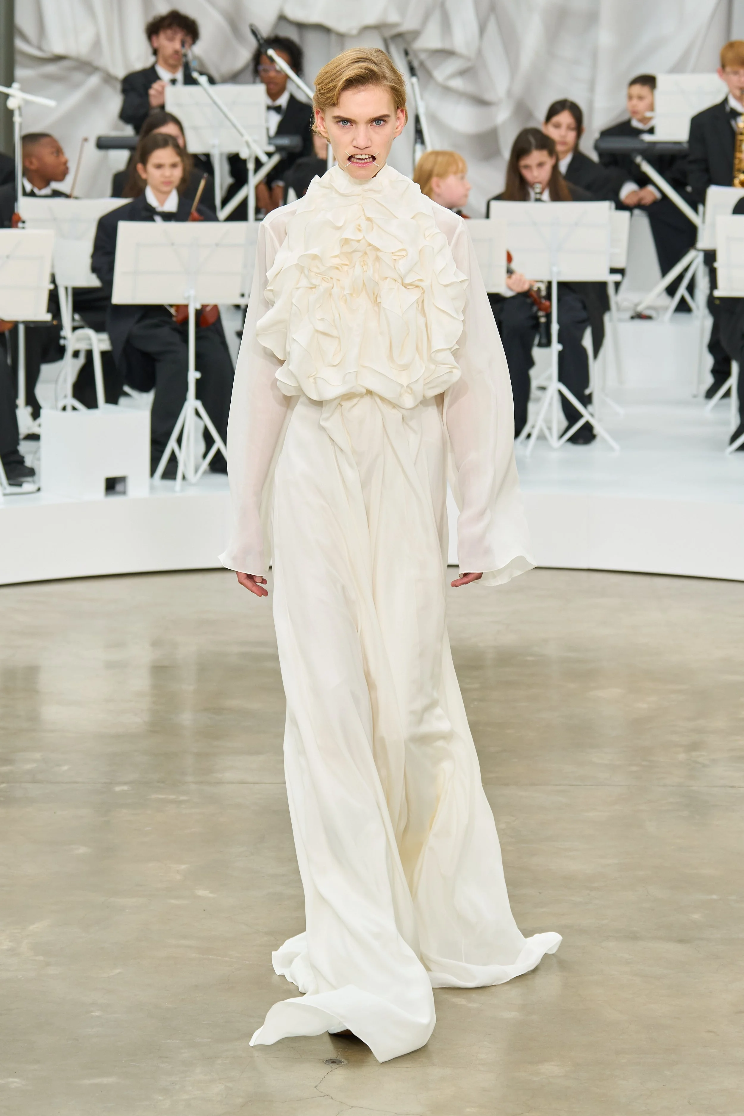
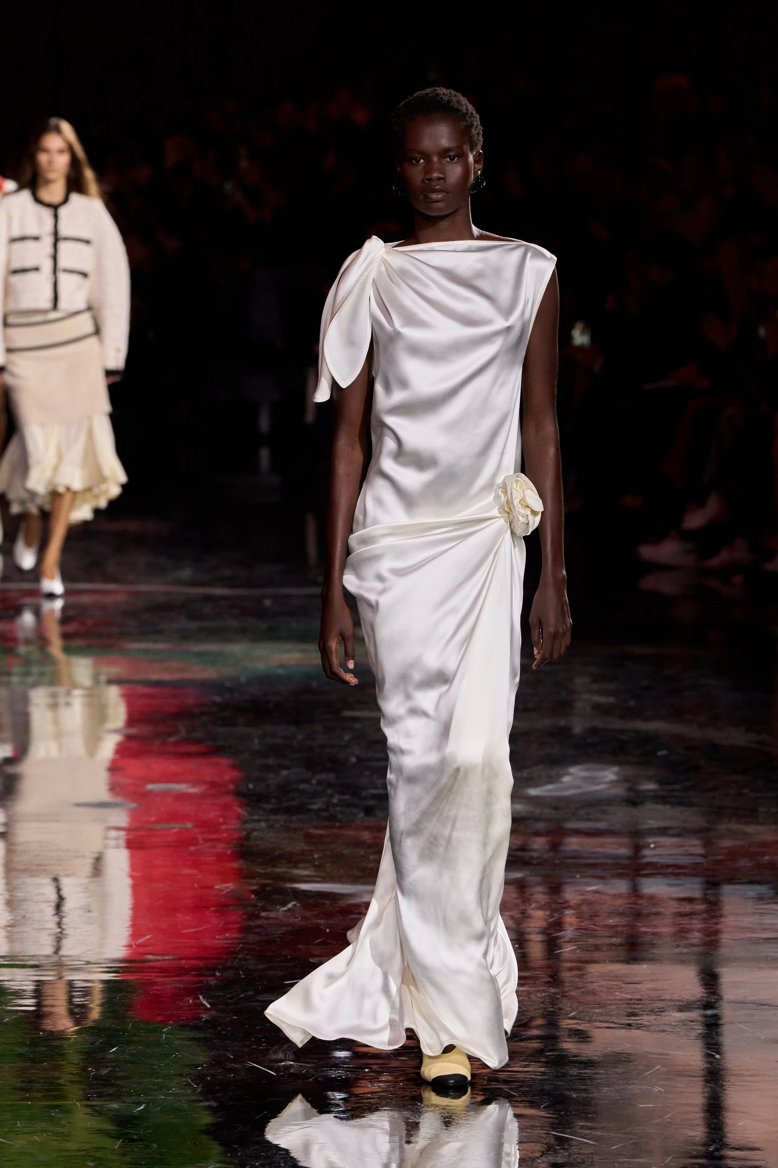
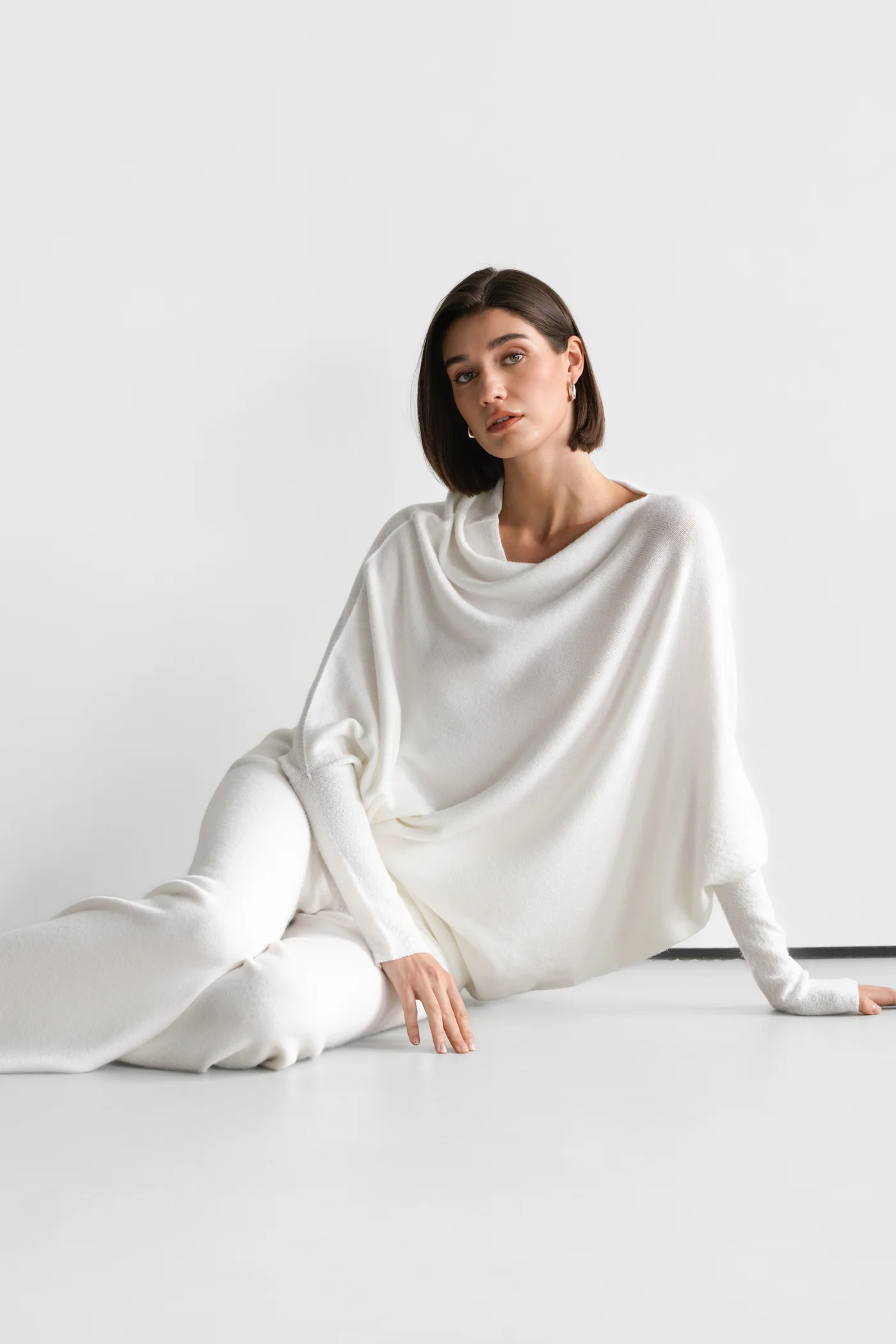
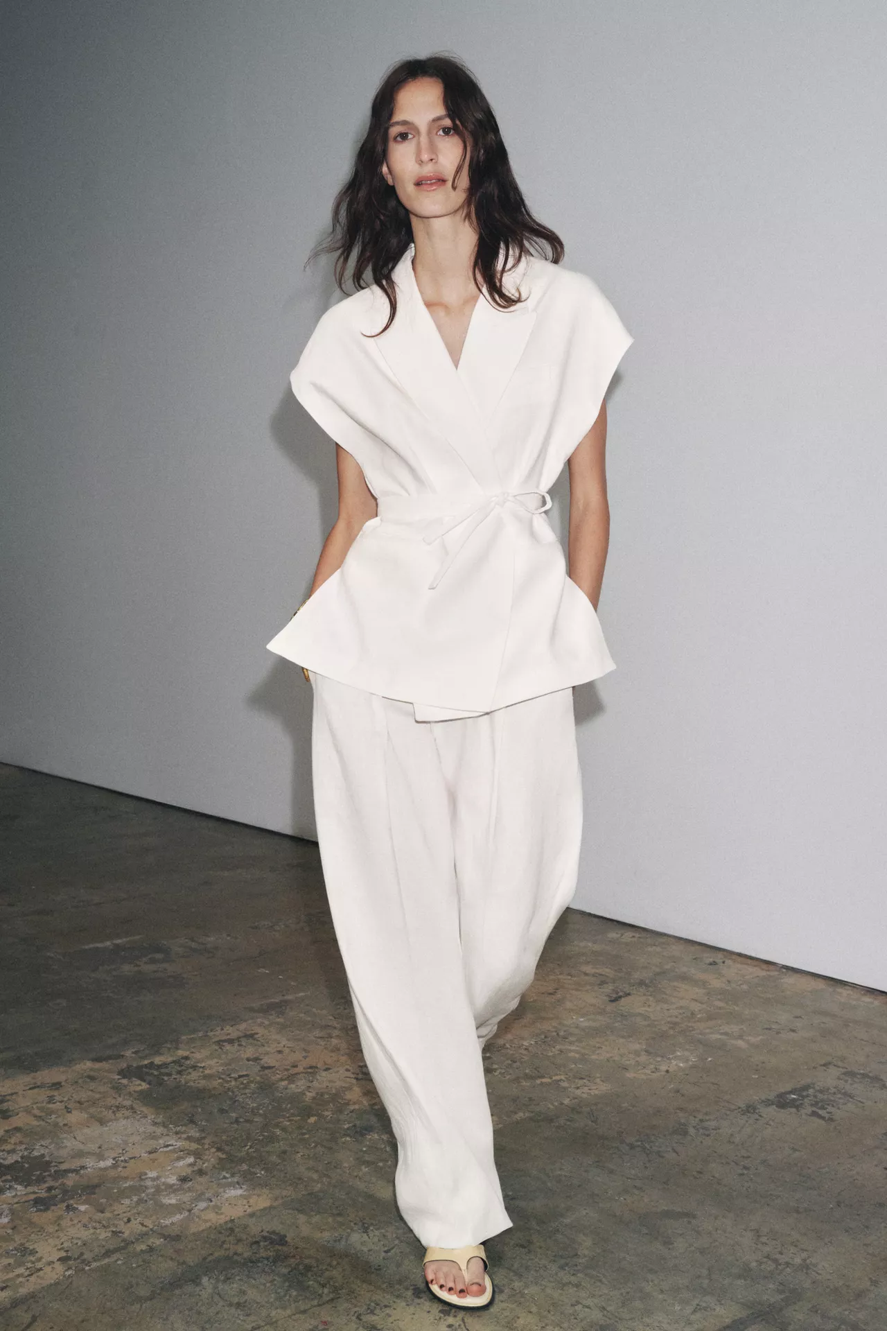
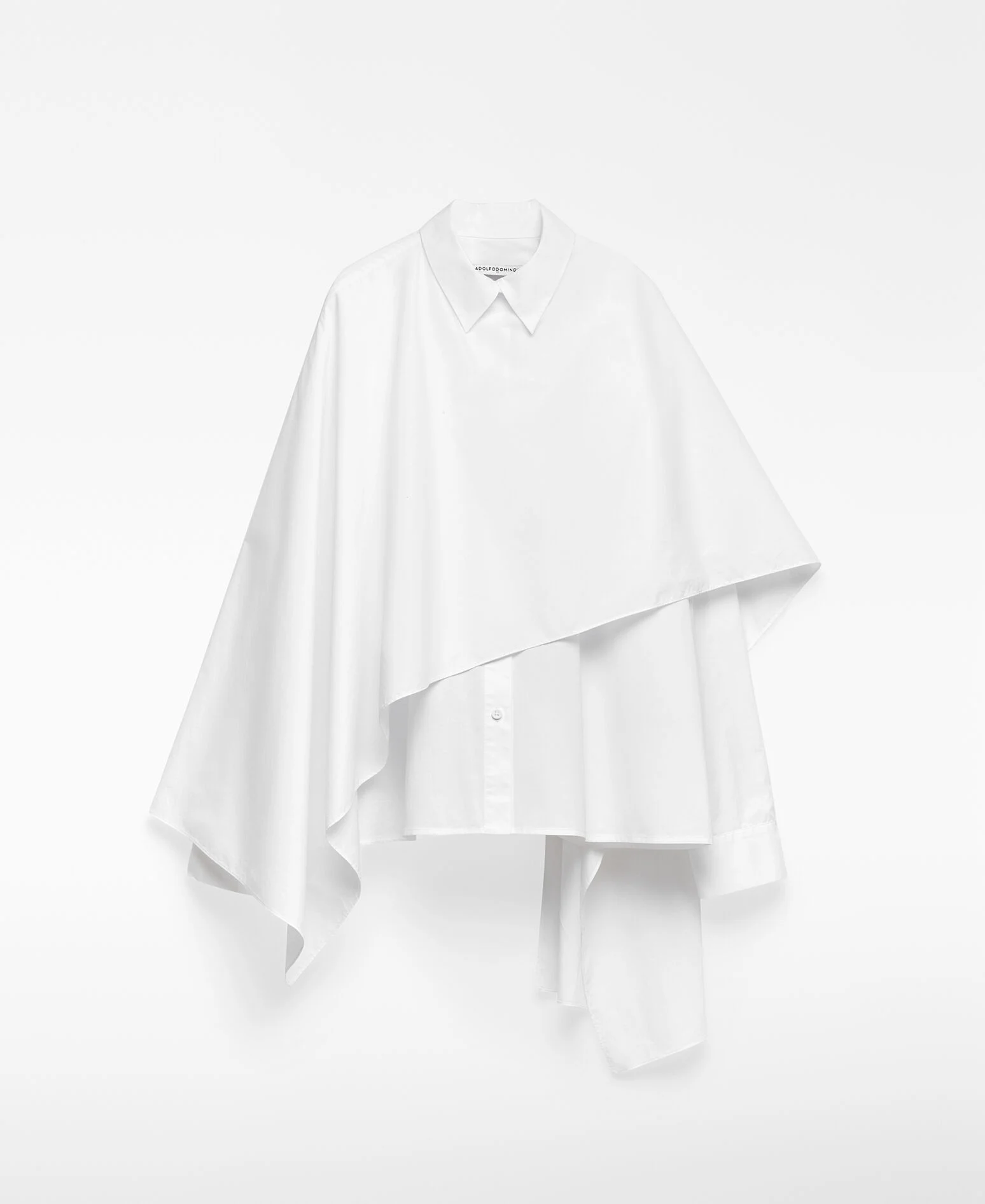
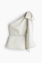
Fashion houses are likely already folding Cloud Dancer into their 2026 collections: billowing off-white silks, sculptural ivory tailoring, ethereal layers that look like they were designed to float rather than walk. Beauty brands will follow with creamy white compacts, luminous skin-first looks, and packaging drenched in minimal, milky neutrals. I’m honestly waiting for bleached brows to make a comeback. Paired it with soft white/pearl eyeshadow or graphic icy liner and you have major editorial moment. Speaking of editorial… Editors will lose their minds — in the best way. We’re about to see:
“Cloud Dancer Wardrobe Edits”
“Cloud Dancer Nails for 2026”
“Beauty Products in This Year’s It Colour”
“Cloud Dancer Interiors”


This is where it gets interesting for brands: If your product even vaguely aligns with the Cloud Dancer palette, you have an instant editorial advantage.Magazines and blogs love to fill these roundups. They need products to feature. And the early months of the year are prime real estate. So if any of your products fits Pantone Cloud Dance aesthetic do the press realise asap.
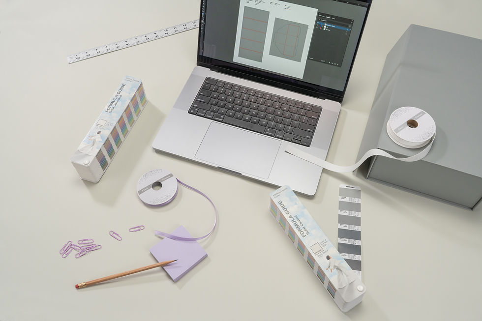
If you don’t use Pantone colour space close enough alternatives are HEX: #F1F0EB and RGB: (241, 240, 235)


Beyond Aesthetics: What Cloud Dancer Signals Emotionally
White has always represented purity, simplicity, and clarity, but Cloud Dancer brings something gentler. It’s soft, forgiving. It doesn’t have the clinical sharpness that turns some people off pure white. Instead, it feels like a pause. A breath. A freshly made bed. The moment before you begin again. It speaks to a cultural fatigue with overstimulation. To a desire for space — real or imagined. To a need for environments that feel safe and spacious rather than demanding.
But white can also be misunderstood. Too much of it without texture can feel sterile. Too little contrast and the energy drops. White it’s a nuanced colour. And that nuance is exactly what gives Cloud Dancer its power. It encourages brands and consumers to rethink what “simple” really means. Simple doesn’t mean empty. Often, it means intentional.
What Brands Should Do With This Moment
Every Colour of the Year is an opportunity, but Cloud Dancer is especially brand-friendly because it’s inherently usable. You don’t have to redesign your entire visual identity or produce a full collection in off-white. Sometimes, embracing a Colour of the Year is more strategic than literal.
You can weave Cloud Dancer into a campaign narrative around clarity, calmness, or new beginnings. You can use it as the backdrop to highlight bolder elements. You can create a limited-edition product or packaging concept that aligns with the shade’s mood and gain free editorial exposure. You can build Cloud-Dancer-themed lookbooks, social content, product edits, or influencer boxes that tie your brand into the cultural conversation.
You don’t need the entire house in white — sometimes a fresh coat on one wall is enough.


Why Cloud Dancer Feels Personal
If you’ve followed my work for longer than five minutes, you already know my favourite colour has always been white. My entire home is a love letter to it — walls, furniture, accents, everything. People sometimes think it’s an aesthetic decision, but it’s really a neurological one. When you have a brain that can tip into overstimulation without warning, the environment you live in becomes medicine.
White, for me, is peace. It’s focus. It’s oxygen.
There’s something about stepping into an all-white room after a chaotic day that instantly drops the nervous system several floors down. And the beauty of white is that it doesn’t demand anything from you. It doesn’t shout. It doesn’t compete. It simply holds space. It lets you decide who you want to be in that moment, what mood you want to create, which direction your creativity wants to wander.
And the versatility — don’t get me started.A whisper of sand and light blue with a touch of navy? Suddenly you’re in a seaside cottage.Add sharp black accents? You’re in luxury territory.Swap them for silver? You’re in a modern, minimalist dream.
If I were rich enough, my wardrobe would be entirely white as well. As it stands, my extensive white-shirt collection is my slow, methodical rebellion against decision fatigue. White goes with everything. White looks intentional when you didn’t have the brainpower to be intentional. White saves me on the days where the rest of my life feels like a scatter plot.
So yes — Cloud Dancer is exactly my kind of spotlight moment. My brain is thrilled. My bank account has already accepted its fate.

A Final Thought
Pantone Cloud Dancer feels like the right choice for 2026 — not because it’s trending, but because it reflects where many of us are emotionally. We want less noise. More clarity. A gentle reset. A calm luxury that doesn’t need to shout to be noticed.
And for me, it’s a rare joy to see the colour that has quietly shaped my home, my wardrobe, and my creative brain finally step out onto the world stage.
If this is the year of soft, intentional clarity… I’m ready for it.


Comments